But never mind all that.
When my novel The Glass Character came out, I was a bit gobsmacked to see the cover. In spite of what the reading public thinks, authors have little or nothing to do with cover art, and the several suggestions I gave my publisher (because they asked me) had been completely disregarded. So I was left with half a green Harold-face with his hair standing up. The hair-on-end picture is almost as iconic (forgive me) as the man-on-the-clock shot, but on my novel it simply doesn't work. I don't think it represents the story very well, if at all. But the novel still holds up, as far as I am concerned, just waiting for that elusive movie deal.
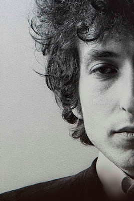
So today I got looking at that half-a-Dylan face, and wondered how it might look put together with MY book's half-a-Harold-face. After all, these are both world-famous images of world-famous men from wildly different times/places.
What did I have to lose? Oh, a couple of hours I'll never get back. But I had to try it!
First I had to split the Dylan face so that it looked like this:
Then I had to convert my book cover to black and white, an easy task. I didn't have to worry about cutting faces in half because my publisher had already done it for me.
Can you see it, is it starting to take shape? But it was not as easy as it sounds. Face-scanning equipment can tell you that even if two faces look similar, features can be totally different in relation to each other. I'd never get an exact match.
But the results surprised me.
Creepy-looking, I know! But take another look at it. The hairline is very close, though it's hard to see under Bob's curly thatch. If Bob bugged out his sleepy eyes a little, they'd align almost perfectly. The nose - just look at how that nose matches up! It's incredible. And the upper lip is so exact that it scares me. I swear I did not retouch this thing in any way, just tried to match photo sizes. The biggest discrepancy is in the jaw and chin. Harold had a sort of leading-man jawline, and Bob does not. His facial features back then were almost childlike. But just look at the rest of it!
So what's the point of all this? I just had to find out what it would look like.
And take a look at this. Since the chin is the feature that matches the least, I decided to crop it out. Now you see the close harmony between eyes, nose and mouth in two men who look not even remotely like each other.
This is a negative of the original cover photo. Here is the same effect with the black-and-white of my cover:
I once had an editor who liked to say, "It doesn't matter what they say about you, so long as they spell your name right on the cheque." And I guess it doesn't matter how bad a book cover is, so long as they can still read your name.


