Thursday, March 3, 2016

Bob Dylan's auction: give me a buck apiece!


Spam I am


Last night, very late, I got into a Thing, and as usual when I am into a Thing, I don't stop until it feels complete. Which this never will be, because it's one of the big themes/obsessions of this blog.

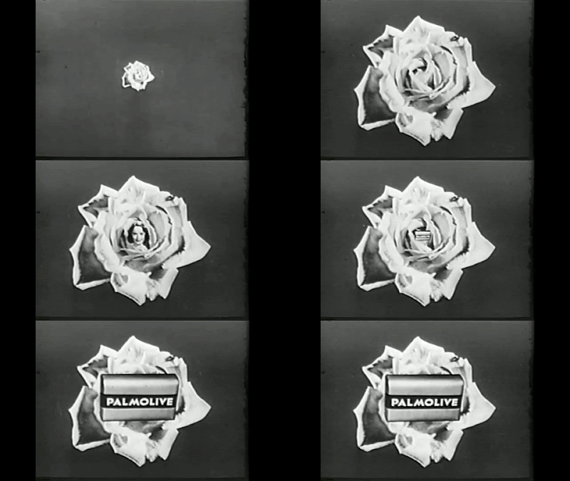
Old ads. Gifs of old ads, so you won't need to watch all of it. Lots of people say "I hate gifs", and I will tell you why. 90% of the ones I see on "real" sites are about 2 seconds long, a near-violent jerking back-and-forth of figures. I don't even know why those are considered "real" gifs, as it is now easy as hell to make 20- or 30-second ones with utterly simple programs like Makeagif or Giphy:

http://makeagif.com/youtube-to-gif

https://giphy.com/create/gifmaker

These.

Some time ago I found a wonderful YouTube channel called MattTheSaiyan, featuring mostly classic ads like the ones I giffed last night. The ones I chose to gif (and I herein present only about half of them) struck some kind of a chord with me, either from familiarity or just plain oddness. It's a weird feeling to see an ad you haven't seen since you watched Queen for a Day when you were seven. Why do we remember these things? As a rule, we were forced to watch them over and over again.

Kind of like these gifs.


One category I particularly like are VERY old ads, probably done live in the middle of a variety show. MattTheSaiyan's ads are edited from reels/videos/DVDs of early television. The "boooop" of an organ is often heard at the beginning of them, indicating live soap operas. An announcer will come on and earnestly present the ad. "Crawls" back then looked like they were mounted on rolls of paper or canvas, and were very likely cranked by hand.


Early advertising was very "in your face", in that someone had finally discovered that TV was not just radio with still pictures. Things MOVED on TV, so suddenly, in the ads, everything was moving. Dove's "1/4 cleansing cream" was so much a part of their ads for so long that I had to include it here along with all the lovely doves. Interestingly enough, Dove now claims that women should think they're beautiful no  matter what they look like. They should, too - as long as they use Dove products.


A lot of the gifs I made last night went to 20 seconds, and really, those are better-quality and more essay-like than these short ones. But they can run a bit weary after a while, if you're not a real afficionado. This is the short version of the Joy ad, the best part really, illustrating that in-your-face, literally explosive quality.


I love this one, and was quite impressed with it when I first saw it. From radiant bathing beauty to radioactivelly CLEAN beauty to. . . bride. It all fits together, doesn't it? If you smell this good, you're going to land a (preferably-rich) husband for sure.


This is a nice one, if a bit vertigo-inducing. Things are literally comin'-atcha. I have a feeling this was a 1950s ad. It's as if they're visually turning up the volume.


I've saved the best 'til last. Who of my generation doesn't remember all these recipes, usually made with Spam or one of its knockoffs (Spork, Klik, Bluggh, etc.) Scraps of pig-snout from the butcher's floor were ground up with plenty of fat as a binding agent. And there you had it: a perfect meat substitute. Spam and eggs! Spam on the barbecue! Spam with pineapple rings (my life is now flashing before my eyes!), and - oh God - Spam with cloves and brown sugar glaze on it, baked in the oven like a ham.

You could do anything to it that you would do to a ham. So says the ad. It was cheep, this Treet. It opened with a key, like a sardine can. And the strange thing is, fried up golden or baked in the oven, it really wasn't too bad. Kind of like really deluxe army rations. Beat the hell out of creamed chipped beef on toast.


Tuesday, March 1, 2016

Have We Been Playing Gershwin Wrong for 70 Years?


(The following is a piece from the New York Times which caught my eye, then dragged me right in. It's pretty long, but I had to reproduce it here in its entirety. It illustrates a crucial point about art: remove one element, or change it, and the whole work is changed in subtle or not-so-subtle ways. This whole story reminds me of the famous gaffe by the art gallery that hung a painting upside-down and didn't notice it for 30 years.)

http://www.nytimes.com/2016/03/02/theater/have-we-been-playing-gershwin-wrong-for-70-years.html

Have We Been Playing Gershwin Wrong for 70 Years?


It is one of the most famous pieces of American music — but for 70 years orchestras may have been playing one of its best-known effects wrong.

The work is George Gershwin’s jaunty, jazzy symphonic poem “An American in Paris,” and the effect involves a set of instruments that were decidedly not standard equipment when it was written in 1928: French taxi horns, which honk in several places as the music evokes the urban soundscape that a Yankee tourist experiences while exploring the City of Light.

The question is what notes should those taxi horns play. In something of a musicological bombshell, a coming critical edition of the works of George and Ira Gershwin being prepared at the University of Michigan will argue that the now-standard horn pitches — heard in the classic 1951 movie musical with Gene Kelly, in leading concert halls around the world, and eight times a week on Broadway in Christopher Wheeldon’s acclaimed stage adaptation — are not what Gershwin intended.


The finding promises to divide musicians, and could require instrument-makers, sellers and renters — who now offer sets of tuned taxi horns specifically for “An American in Paris” — to consider investing in new sets tuned to the new notes. The change would give a subtle, but distinctly different, cast to a classic score that was influenced by some of the leading composers of its day, and which followed in the footsteps of other works that employed so-called “found” instruments, including Satie’s 1917 ballet “Parade,” which uses a typewriter and gunshots, and Frederick Converse’s 1927 “Flivver Ten Million,” an ode to the Ford automobile, which uses car horns.


“I have a feeling that percussionists are going to be somewhat put out by this whole conclusion,” said Mark Clague, the editor in chief of the critical edition, who attended some test performances of the revised score by the Reno Philharmonic last month.

The ambiguity stems from how the taxi horn parts are notated in Gershwin’s original handwritten score. To put it in Gershwin terms, we got rhythm: The score shows that the horns play sets of accented eighth notes. But when it comes to pitch, things are less clear. Gershwin’s score labels the four taxi horns with a circled “A,” a circled “B,” a circled “C” and a circled “D.” Those circled letters have been interpreted as indicating which note each horn should play — A, B, C and D on the scale — since at least 1945, when Arturo Toscanini used those pitches in recording the piece with the NBC Symphony Orchestra.


This is the original version recorded in 1929 under Gershwin's supervision. Take note of the sound of those taxi horns!


But the new critical edition will argue that Gershwin’s circled letters were merely labels specifying which horns to play, not which notes. Mr. Clague, an associate professor of musicology at the University of Michigan, mentioned that Gershwin handpicked taxi horns to buy during his 1928 trip to Paris, and that friends and colleagues recalled that he had been particular about which notes they played. Mr. Clague also pointed to the evidence of a Victor recording of “An American in Paris” that was made in 1929, under Gershwin’s supervision and presumably using his horns: The taxi horns on that recording sound a more atmospheric, more dissonant set of notes: A flat, B flat, a much higher D, and lower A.

Gershwin’s original instruments seem to have been lost. Michael Strunsky, 81, a nephew of Ira Gershwin and trustee of his estate, said in a telephone interview that his father, William English Strunsky, had played the taxi horns when George Gershwin first gave an informal recital of the piece for the family in 1928 after sailing back from Europe.


“I went looking for those taxi horns once,” Mr. Strunsky said. “And somewhere in the moves back and forth, and this and that and the other thing, they disappeared.”

Russ Knutson, the owner of Chicago Percussion Rental in Illinois, who rents out tuned horns for “An American in Paris” and has played them on occasion, said in an interview that he thought that the currently accepted A, B, C and D pitches “fit exactly in the score.”
“The whole country and the whole world have been oriented to doing it with those four pitches,” he said in a telephone interview. “All of the recordings you’ve heard are with those four pitches.”

But Trey Wyatt, a percussionist with the San Francisco Symphony who estimated that he had played the horn parts 40 or 50 times, and who rents out several sets through his company, California Percussion Rental, said that he was intrigued by the finding.

“If this new tuning takes off, I may have to buy another five sets of these horns,” he said.


Rob Fisher, the musical score adapter and supervisor of the new staging of “An American in Paris” currently on Broadway, said that he agreed that the A, B, C and D labels were names and not pitches, but that the show had ended up using the standard horns.

But he questioned whether the pitches used in the Victor recording should be taken as gospel. “I don’t ever want to say what was in somebody’s mind,” he said. “Were those the four horns that made him the happiest that day, when he was picking horns? I just feel like if he’d wanted exact pitches for his horns, he was really good about writing down intentions.”

Mr. Clague said that between the 1929 recording that Gershwin supervised and the 1945 Toscanini recording, which seemed to help establish a new performance tradition, there was great variation in how the taxi horns were played. But he said that his musical analysis gave weight to the idea that the pitches used in the 1929 Victor recording work best. “George was thinking harmonically and melodically with the taxi horns,” he said. “It’s not just a sound effect.”

But he added that there would have been an easy way of avoiding the ambiguity entirely. “I think George would have saved everybody a lot of trouble,” he said, “if he had just numbered them ‘1,’ ‘2,’ ‘3,’ and ‘4’ rather than ‘A,’ ‘B,’ ‘C’ and ‘D.’”


Blogger's Observations. I decided I'd do this whole thing by ear, as a sort of auditory blind taste test. I'd try to determine which version was the "true" one: the one we currently hear in concert halls and have been hearing for 70 years, or the first recording ever made in 1929, supervised by Gershwin himself.

I've been listening to An American in Paris since I was a wee tot, and I even remember my mother explaining to me that it used real taxi horns, which I thought was pretty strange. I'm not a musician, but I was saturated in music from the get-go, surrounded by real musicians, and by inheritance came in with the same equipment, meaning a pretty sharp ear. So I sat back and just plugged myself in to the sound, going back in time to that 78 r.p.m. record made in 1929.

The very first blast on the first taxi-horn made me sit bolt-upright and yell, "AAAAHHH!" It was completely different, a totally different sound! The blasts that came after that were even more of a revelation: lower, earthier, more dissonant, with the odd higher note to add harmonics (for Gershwin heard music in noise: he said so all the time). These sounds were just so much more. . . Gershwiny.


I am utterly convinced that these are the taxi horns Gershwin originally used. These are the horns he collected while in Paris, scrounging around in auto shops and junk stores, then picking four out of a couple of dozen to match his score - no, wait. It's bigger than that. THE SCORE WAS MATCHED TO THE HORNS. The two came together like a hand in glove.

You wonder how orchestras could've gotten it so wrong for so long. To write A, B, C and D and circle them is pretty obviously a way to label each horn, not describe the horn's tone. It's just self-evident, isn't it?

Now people are saying they wish Gershwin hadn't been so "ambiguous". He was a genius, people, and geniuses are ambiguous by nature, leaving the rest of us snail-brains in the dust. Now some percussionists, suffering from defensiveness and hurt pride and unable to admit they may have been wrong, are insisting WE had it right all along, and Gershwin had it wrong. Or that it didn't matter. Or that, when making the original 1929 recording, he just picked out the horns he happened to want on that particular day, pulled them out of the junk pile pretty much at random.

DON'T MAKE ME SCREAM.

Gershwin was an utter perfectionist. He never took stabs at things, not even improvising. It was from God's mouth to his ear/fingers. His scores were as immaculate as Mozart's, not a note out of place. He wouldn't just rummage around in his junk drawer and pull out a few taxi horns.


The problem is, he did not happen to consider that people would not know how to reproduce those exact sounds in the years and decades to come. Perhaps he believed it was self-evident and that they couldn't possibly get it wrong. So somebody took a flying-leap guess based on some letters with circles around them on the score (and if the piece is in the key of A, it obviously would have a great big circle drawn around the A. Isn't that how you tell what key something is in?), and thus the whole thing became standardized.

I want to keep listening to that original recording, except that it makes me want to cry. Gershwin went through so much in his short, sometimes very painful life: his masterpiece Porgy and Bess was cut by about a third for its first performance (though most operas more than exceed its original length); the critics slung mud at it and called it garbage. He was a sensitive soul and he DID care what people thought, though artists aren't supposed to. And then he died at 38, and in so much agony, essentially alone.

So for God's sake, people. Get those taxi horns right! It's the least you can do for poor George.


  Visit Margaret's Amazon Author Page!


Embarrassing urgency? Try this!


Monday, February 29, 2016

Would it KILL you to applaud?


I don't know Jenny Beavan from a hole in the ground, nor do I know anything about the Mad Max series, though judging from last night the franchise is more than thriving. But this! This is the height of ungraciousness  in an audience. This is annoying in that the clip only lasts 3 seconds and keeps repeating (sorry, folks, but that's all I've got!). But focus on those men sitting on the aisles - you know, the ones who aren't applauding a legendary costume designer who has just won an Academy Award.

Not. Applauding. At. All.

Take a look, furthermore, at their expressions, and we see: snickering; blankness; angry contempt; catatonia; more contempt, even more snarly and vitriolic - before we almost get to Julia Roberts, who, bless her heart, is beaming.

Costume designers usually dress badly. They look frumpy, like Edith Head, or sink into the wallpaper, like Stella McCartney. It's what they do; it's what we expect of them. Unable to keep up with the hopeless and overstuffed glamour of Hollywood's most narcissistic night, Jenny Beavan made a decision to dress however-the-hell and be comfortable. In fact, she went on record to say that, for her, this faux biker-Mama look was "dressed-up".


Stephen Fry, my favorite maiden grand-aunt, once pronounced Beavan a "bag lady", and it's true that she's laying on the anti-glamour pretty thick here. But the more I look at these unguarded facial expressions - the anger, the disgust, the refusal to even politely applaud - the more disgusted I am with the Hollywood glamouratti and their stick-up-the-ass brigade of tuxedoed snotheads.

Keep looking at this gif and it just gets more disturbing. Really, nobody is applauding her. I only see two people very feebly making an attempt, and everyone else is sitting there like stone. Two of the men have their arms crossed so hard, they would have to be pried apart with a crowbar.

What is WRONG with these people anyway? The message, raw and in your face, is "you don't look right. What the hell are you doing winning an award?" It's a non-acknowledgement, pretending that nobody's walking up the aisle, or else somebody made a mistake and let a real person in.

Fortunately she does not give a rip. This telling three-second clip says everything about them (and their hateful pettiness and spite) and nothing about her except a refreshingly up-yours attitude.


POST-BLOG OBSERVATION. This, apparently, is the jacket she was wearing, a "pleather" from Marks and Spencers. Looks a bit slim-lined for her full figure, but never mind. All those zippers give it a sort of dominatrix look. I had a jacket like that once, and the zipper busted pretty quickly. I want a look at the back of it - I'll try to find an image of it.

If Cate Blanchett had worn this, they would've called it a "bold fashion statement".


Of course! It's a Mad Max logo. As in Fury Road, as in "I just won Best Costume Design for this".


 I here-and-now predict a massive run on these jackets. Marks and Spencer won't be able to keep up.


The Oscars: don't diss dis dress!


I didn't get far with the Oscars tonight, bailed on it well before the end, telling myself I could always watch it on my DVR tomorrow, commercial-free (which I probably won't). I did enjoy Chris Rock's razor-edged swordplay more than I thought I would; we've had far too many wooden or too-predictable hosts (and since when does a movie star know how to work a crowd? Most of these people have never even stood in front of an audience before!), so watching him blow on taboos that were already teetering on the verge of collapse was gratifying.


Blather about fashion usually supercedes - I won't say "trumps" because that word has been ruined forever - blather about Best Picture (which went, unexpectedly, to Spotlight, a glaring expose of a ruthless and rotten crime against humanity which festered underground for decades). More often than not I find myself groaning over the gown. Is Lady Gaga really wearing a dress AND pants? What's that red thing Charlize Theron has on, and how is it staying up there?


But soft - here's a dress, and one somebody put on their WORST-DRESSED list! This is Brie Larson, who won Best Performance by an Actress for a movie called Room. It's one of those ripped-from-the-headlines stories in which someone endures years of confinement at the hands of a demented sadist. The exposure of long-hidden atrocity seems to be a theme this year, unusual for Hollywood with its celebration of the callow and the shallow. Does this mean the motion picture industry is finally growing up?

Anyway, here's Brie Larson on the red carpet in a gown I absolutely love. Those little pleats and flounces, the way the thing drapes, the saturated jewel-tone colour - look, I am anything but a fashion maven and go about in sweaters and cords, but this thing - just look at it! It floats and drapes and just looks perfect. The belt is to die for. I wish I could see it up close. Doesn't seem fair that someone so accomplished could look this beautiful, but there it is.


MY red carpet moment will come when someone finally wants to make The Glass Character into a feature film. Hell, it could happen, couldn't it? When it does, when I'm sitting in the audience waiting for them to announce Best Adapted Screenplay, as they read the winner while Ron Howard gives me the thumbs-up, it won't matter a dingity-dong what I'm wearing because I'll be in such a trance of happy unreality.

Didn't it start out just as an idea in my head? And end up as a book 49 people bought - if that - because I just don't have the magic secret of how to write a bestseller? But never mind. It took Kirk Douglas TEN years to get anyone interested in his screenplay of One Flew Over the Cuckoo's Nest (one of my favorite movies: mental patients as fully-realized characters, gutsy, funny, crazy in their woundedness, wounded in their craziness), and by the time Milos Foreman finally signed on, Douglas was too old to play Randle P. McMurphy and they had to bring in Jack Nicholson.


They can bring in anyone they want, as far as I am concerned. Anyone. But I want Joseph Gordon-Levitt, even though he looks nothing like Harold. He has the chops, and the twinkle, and the bust-out energy and impudence and charm, and I know he could pull it off. Being an A-lister, I'll probably have to get Ron Howard on-board first before we can sign him up.

I can see it. . . yes, I can see it now. . .