Showing posts with label 1948. Show all posts

Tuesday, November 17, 2020

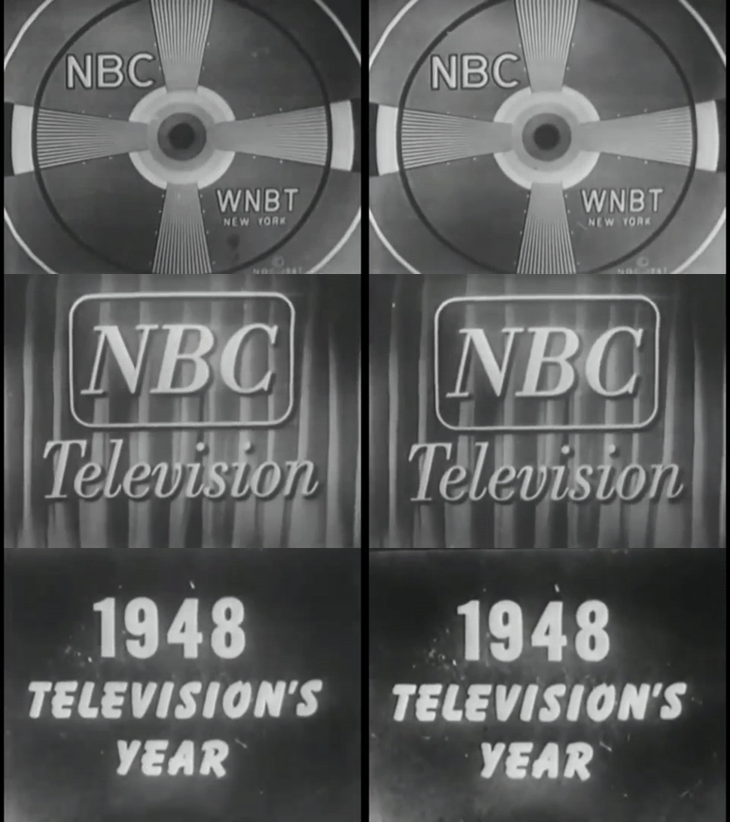
1948: Television's Year

 
1948: Television's Year


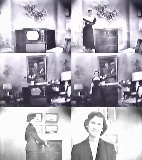
There was something special about 1948. That was the year people started buying TVs, though they were still called "television sets" and built into elaborate cabinets with swinging doors (sometimes incorporating a radio and a small refrigerator). The feeling was that the big, naked glass eye was going to see right into the living room unless it was covered up. At very least, all that exposed glass was somehow disturbing. In the ads for Dumont television sets, which were state-of-the-art, an attractive woman always walked into the frame and CLOSED the cabinet doors, instead of opening them dramatically to display the set. Something odd about that message: see how you can hide the whole thing!


                                                  Like so.

People didn't watch TV then: they "looked at television", a sort of parallel to "listened to the radio". The programming was primitive, the picture quality dark and smudgy. We must take into account, however, that there was no videotape then, and all we have left from those spookily magical times are kinescopes, filmed directly off the cameraman's monitor which was probably small, dark and unstable (a good description of the shows and their stars).


Variety shows ruled. This was a hangover from vaudeville that carried on into the late '60s with shows like Ed Sullivan and Hollywood Palace. But these programs were not much more than radio with pictures. In some cases, as with Jack Benny and Milton Berle, they were performed on a stage with curtains, and even with an announcer holding a microphone. 

Not that I remember any of that. No, I really don't.


This looks like satire, but it isn't. It's an example of the kind of programming you'd see during the day - filling time, mostly. Note, at the end of this, there's a little blurb for Kovacs on the Corner - one of Ernie's earliest TV incarnations. He had to fill four or five hours of air time a day, and did radio "on the side". 


This is a strange one, an example of the way TV had NO IDEA how to handle visuals. The opening credits are just a primitive, probably hand-cranked crawl with blocky white letters on grey. Carlton Emmy and his Mad Wags sound particularly frightening. And those 50 Olsen and Johnson Punchinellos sounds like about 48 Punchinellos too many.


So what exactly is that little symbol, anyway? A banana wrapped in some sort of tape? Auto-Lite must have been the sponsor of this thing, which MIGHT have been one of those shows that pre-famous actors acted in. In spite of all the rich programming in drama, it was considered a poor cousin and only a place for a screen actor to "start". That feeling still hangs in the air, maybe because of Netflix.


Until I find a stranger one, this is the strangest: Okay Mother, starring. . . Dennis James? A transvestite, perhaps, sort of like Mrs. Doubtfire. And three sponsors for what might have been a 15-minute show (a common format then)?


I never know where all these come from (though I make them from YouTube videos). There's something called the Prelinger Archives that must have gazillions of them, and an Internet Archive that has never made a damn bit of sense to me. Maybe people kept them in their basements? Some people buy old VHS tapes at flea markets and at auction in hopes there's something good on them. Do I miss the good old days of VHS, or, in our case, Beta? No. I love my DVR and would never go back. But Smudgeville has its charms. 

This logo is a prime example of "don't worry, folks, TV is really just your old familiar radio in a new form". The huge microphone receiving, then blasting out sound waves, the telephone pole emitting - whatever it is emitting, lightning bolts? - almost seems like a reassurance that this is something we already know. Sort of. Just keep it covered up when you're not looking at it.


I have a thing for logos, so I'll include this particularly dull one. The three-note chime was held over from the radio, though it took quite a while for NBC to come up with a good visual to go with it.


The NBC peacock in all its glory, before they dumbed it down into its current dull form.


Please Stand By.

Here are some more, from just a couple years later, perhaps 1950 - '52. Most of these are based on a YouTube series by MattTheSaiyan called Classic Commercials for Defunct Products. There are, so far, 119 videos, so you may be seeing these for some time.


Though these look like animated cellphone prototypes, I think they're supposed to be dancing cameras. Though they could also be remote controls. Early TV animation was primitive, not to mention strange in its concepts.


If you look carefully at this Dumont TV commercial, a rare instance of the cabinet opening rather than closing, you'll notice the "zoom" wobbles in a way that looks suspiciously like the cameraman is walking towards the TV. The bleary distorted picture is state-of-the-art and meant to inspire ooohs and ahhhs.


A particularly delightful ad for a hair-care product, Toni Home Permanent. The ads in this era showed women with lacquered, military-helmet-like hair which was touted as "soft and natural". The do-it-yourself perms, always described as quick and easy, were a mass of "pin-curls" all over the head which would be impossible to do on your own. The real irony here is that in the "before" pictures, the women have hairstyles much closer to what we see today,


Yes, yes, I know I devoted at least one entire post to Pream commercials. But this reaction is hands-down my favourite.


I love the element of surrealism here! It's for a dishwashing liquid called Kind (very defunct now).

Blogger's note. I re-posted all these gifs from several years ago, because it took so long to make them (and I'll never have that recipe again, OH NOOOOO), and recently got a new comment from someone on the original post. I love it when that happens!  My gif program is far more sophisticated now, and I can make compilations, crop away the black borders, etc., so I cleaned them up a bit - but left some of them as is, to keep that sense of crude magic.
BTW, the YouTube channel from which I derived almost all of the vintage ads is now "disappeared" - it vanished without a trace a couple of years ago. Copyright issues? Let's hope they don't come for me next.

Tuesday, June 27, 2017

Cars Of The Future from 1948


Three plug-ugly cars which never got beyond the prototype stage. The first one, a 1948 Davis Divan, looks like a cross between a bedroom slipper and a steam iron. It might also pass as a Bob Clampett cartoon character. Supposedly it could hold four people across, or two people from 2017 in a tight pinch. I saw someone on YouTube (Jay Leno - see video below - I found it finally) try to drive a reconstruction, and he complained it kept tipping over.

The second one is oh, oh, my God, just horrible to contemplate, as lumpy as the Elephant Man, an airstream trailer with a horrible disease. I guess it sort of looks like someone's idea of a futuristic rocket, but it somehow does not get off the ground. 


The third one commits the sin of being merely dull. It's a kind of '40s  race-car-type-thing, but why the wheels are encased like that puzzles me. Wouldn't that make them more susceptible to damage? 

There were hundreds of "futuristic" designs like these, and in many cases the designers found backers, pocketed the money, then got out of town fast. 


Friday, March 18, 2016

1948: Television's Year


There was something special about 1948. That was the year people started buying TVs, though they were still called "television sets" and built into elaborate cabinets with swinging doors (sometimes incorporating a radio and a small refrigerator). The feeling was that the big, naked glass eye was going to see right into the living room unless it was covered up. At very least, all that exposed glass was somehow disturbing. In the ads for Dumont television sets, which were state-of-the-art, an attractive woman always walked into the frame and CLOSED the cabinet doors, instead of opening them dramatically to display the set. Something odd about that message: see how you can hide the whole thing!


Like so.

People didn't watch TV then: they "looked at television", a sort of parallel to "listened to the radio". The programming was primitive, the picture quality dark and smudgy. We must take into account, however, that there was no videotape then, and all we have left from those spookily magical times are kinescopes, filmed directly off the cameraman's monitor which was probably small, dark and unstable (a good description of the shows and their stars).


Variety shows ruled. This was a hangover from vaudeville that carried on into the late '60s with shows like Ed Sullivan and Hollywood Palace. But these programs were not much more than radio with pictures. In some cases, as with Jack Benny and Milton Berle, they were performed on a stage with curtains, and even with an announcer holding a microphone. 

Not that I remember any of that. No, I really don't.


This looks like satire, but it isn't. It's an example of the kind of programming you'd see during the day - filling time, mostly. Note, at the end of this, there's a little blurb for Kovacs on the Corner - one of Ernie's earliest TV incarnations. He had to fill four or five hours of air time a day, and did radio "on the side". 


This is a strange one, an example of the way TV had NO IDEA how to handle visuals. The opening credits are just a primitive, probably hand-cranked crawl with blocky white letters on grey. Carlton Emmy and his Mad Wags sound particularly frightening. And those 50 Olsen and Johnson Punchinellos sounds like about 48 Punchinellos too many.


This is interminable, but I include it just for that reason: people's attention spans were much longer then, and/or they read much more slowly. The fact that after all that waiting and waiting and waiting, we get. . . SUSPENSE. . . seems a bit ironic. And what is that Auto-lite thing anyway?


Until I find a stranger one, this is the strangest: Okay Mother, starring. . . Dennis James? A transvestite, perhaps, sort of like Mrs. Doubtfire. And three sponsors for what might have been a 15-minute show (a common format then)?


I never know where all these come from (though I make them from YouTube videos). There's something called the Prelinger Archives that must have gazillions of them, and an Internet Archive that has never made a damn bit of sense to me. Maybe people kept them in their basements? Some people buy old VHS tapes at flea markets and at auction in hopes there's something good on them. Do I miss the good old days of VHS, or, in our case, Beta? No. I love my DVR and would never go back. But Smudgeville has its charms. 

This logo is a prime example of "don't worry, folks, TV is really just your old familiar radio in a new form". The huge microphone receiving, then blasting out sound waves, the telephone pole emitting - whatever it is emitting, lightning bolts? - almost seems like a reassurance that this is something we already know. Sort of.  Just keep it covered up when you're not looking at it.


I have a thing for logos, so I'll include this particularly dull one. The three-note chime was held over from the radio, though it took quite a while for NBC to come up with a good visual to go with it.


The NBC peacock in all its glory, before they dumbed it down into its current dull form.


Please Stand By.


(Uhhhm . . here are some more, from just a couple years later, perhaps 1950 - '52. Most of these are based on a YouTube series by MattTheSaiyan called Classic Commercials for Defunct Products. There are, so far, 119 videos, so you may be seeing these for some time.)


Though these look like animated cellphone prototypes, I think they're supposed to be dancing cameras. Though they could also be remote controls. Early TV animation was primitive, not to mention strange in its concepts.


If you look carefully at this  Dumont TV commercial, a rare instance of the cabinet opening rather than closing, you'll notice the "zoom" wobbles in a way that looks suspiciously like the cameraman is walking towards the TV. The bleary distorted picture is state-of-the-art and meant to inspire ooohs and ahhhs.


A particularly delightful ad for a hair-care product, Toni Home Permanent. The ads in this era showed women with lacquered, military-helmet-like hair which was touted as "soft and natural". The do-it-yourself perms, always described as quick and easy, were a mass of "pin-curls" all over the head which would be impossible to do on your own. The real irony here is that in the "before" pictures, the women have hairstyles much closer to what we see today,


Yes, yes, I know I devoted at least one entire post to Pream commercials. But this reaction is hands-down my favourite.


I love the element of surrealism here.


This is a riff on Jack and the Beanstalk, an example of bizarre early-TV animation. Dancing oat flakes are a new one on me.