This is the kind of thing that used to scare the hell out of me when I was a kid. And I don't know why, except that I was maybe three years old and both fascinated and repelled by the strange black box that appeared in our house at just about the same time I did. You would think that I, being a vid kid, would be completely unfazed by its beeps and crackles, but no. It was all so smudgy and black and surreal, and when I see one of these things today it calls up a lot of feelings from extremely early childhood, if not infancy.
The first TV logos were ugly, mainly because nobody knew how to design them. This one is crazy because it seems to be showing sound waves like lightning-bolts going INTO a microphone, and smooth waves going out. Then there's some sort of an image like a telephone pole with more jaggedy lines coming out of it.
Though it's TV, this looks like a logo for a radio station, and indeed the late 40s - early 50s was a time of bridging two media that were far more different than anyone knew. At first it was just slapping some pictures onto the sound track, much the way silent film directors (Harold Lloyd?) grafted sound tracks onto movies. I remember "The Jack Benny Program", in which the radio superstar came out in front of a curtain to introduce the show to a studio audience, followed by a program that would have been completely understandable even if you kept your eyes closed. It wasn't until Sid Caesar and Uncle Miltie and those other falling-down weirdos came along (Ernie Kovacs?) that all the visual possibilities of the new medium began to bloom.
For some reason, NBC logos seem to show more imagination than most (though the CBS eye with its opening-and-closing aperture wins points for sheer creepiness: more about that later). This is a pristine version of the first peacock symbol used by NBC, and by far the most beautiful. Its gracefulness and complexity make it a moving work of art. It has a sort of art deco/harlequin/stained glass pattern which at the very end bursts into multicolored flaming torches. Too bad hardly anyone saw it, because no one had "living color" in 1957. Over the years the peacock was dumbed down until it had only six "feathers" and didn't really look like a peacock at all.
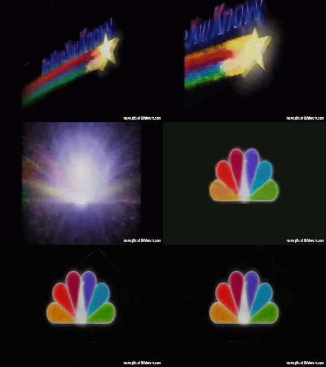
I'm not sure what they're trying to do here, making a shooting-star image turn into the peacock logo. It simply doesn't work. To me it resembles nothing more than a Lucky Charms commercial, with its magically delicious, chemically-neon-colored rainbow. (If you can read what's above the shooting star, you're doing better than me. I'm dying to know what it says. Almost looks like "did you know", but not quite.)
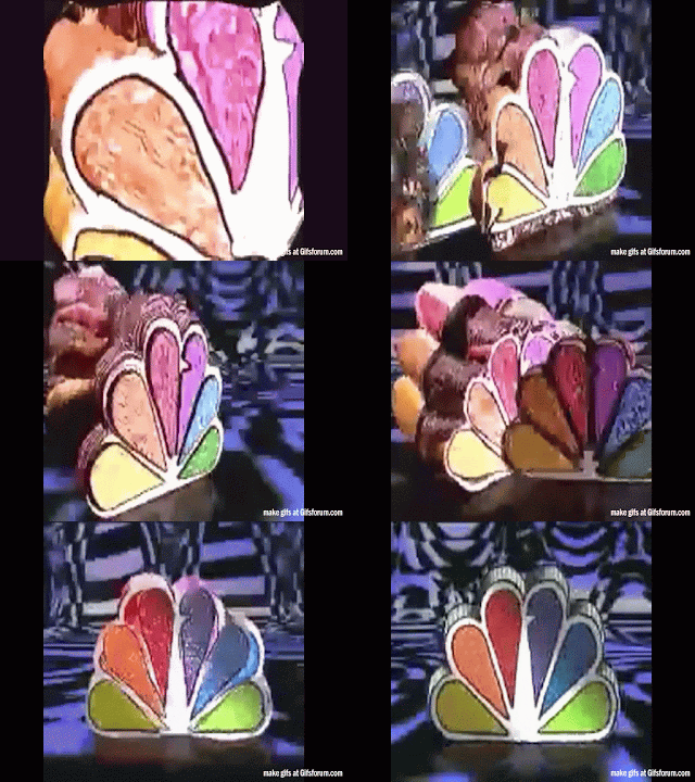
This one is about as bizarre and ugly as it gets. Why is this strangely-colored blob floating around in water? It looks like a cake of soap, then a second blob melds with it in a sort of psychedelic Peter Max way. The different colors of the spectrum melting together? But the peacock DOESN'T HAVE the different colors of the spectrum any more! It's a dumbed-down kids' rainbow thingie, and besides, what IS that shit in the background, I mean in behind the halves of the bird logo? Looks like a giant turd to me. The more I look at this, the more it looks like an amateurish stop-action thing, the kind a kid would make on their ipod. Claymation! Gumby's worst nightmare. Great works of art like the original NBC peacock logo should NOT be tampered with. It's like using a roller to paint over a Van Gogh.
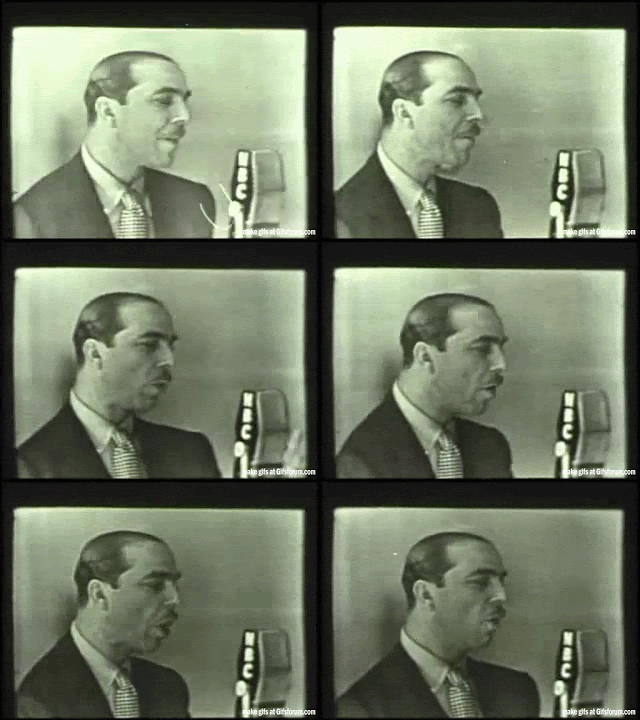
All this was stressful enough to drive me back into the vaults. I've been nosing around in the YouTube catacombs all afternoon (I told you I have no life!) looking for signs of the awkward transition from radio to TV, and at one point I noticed that one of the announcers kept looking down at his script. Obviously cue cards and prompters didn't exist then - nobody had even thought about it. Nobody knew how to look the camera in the eye without eye-bouncing or zombie-staring. New medium? What are you talking about?
The grainy surrealism of early TV, especially the really wonky wobbly stuff from the 1940s, appeals to me. This dreamlike running-man image was sucked out of a very strange blooper compilation from the early '50s, in which a quite-drunk woman, after repeatedly fluffing her line in a comedy sketch, said (I quote), "Fuck, fuck, fuck, fuck, fuck." This brought the production to a stunned standstill. The broadcast was going out live and nothing could be done about it. There were some guffaws from the crew, but if a studio audience was there (which there usually was), they were too traumatized to laugh. The surviving kinescope really should have been burned, but was probably hidden away somewhere for the stag reel they showed at Christmas.
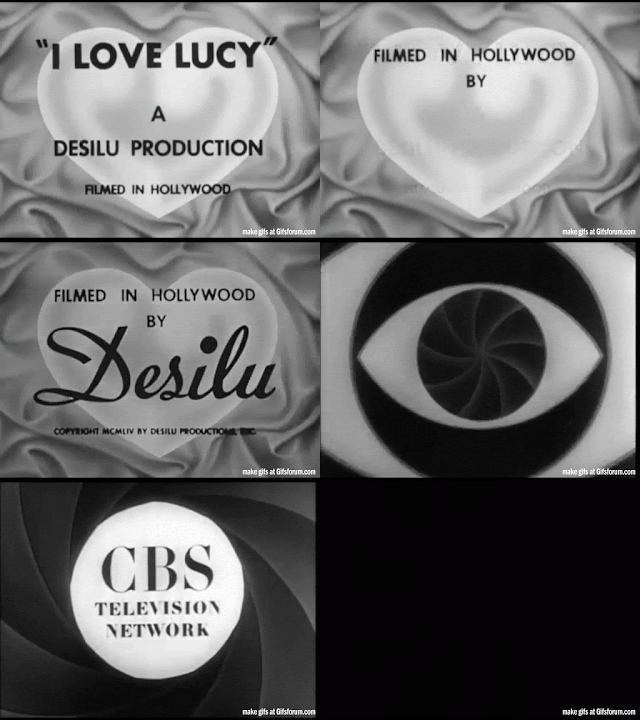
Most early TV show openings aren't too memorable (with the exception of Car 54, Where Are You?, which I will deal with in another post), but I Love Lucy trumped them all in sheer elegance. The opening and closing segments had to be redone for syndication because they originally featured animated versions of Lucy and Ricky - smoking. Whatever the brand was - Phillip Morris, I think, with that horrid little dwarf. Whoever designed this version, the one everybody remembers, was an artist, contrasting the bold letters of the title with the luminous silver heart nestled in what looks like folds of silk. (Come to think of it, that's pretty sexy.) The closing crawl lasted a full minute, during which we were treated to the roomba-roomba-roomba of Desi Arnaz's conga band.
And this is sheer class: the deft Desilu signature in bold script, followed by that spooky CBS "eye" that sucks you right into the past. Or into eternity. Whichever makes most sense to you.
