Showing posts with label scary logos. Show all posts

Tuesday, September 27, 2016

Rainbow Release: more creepy logos!


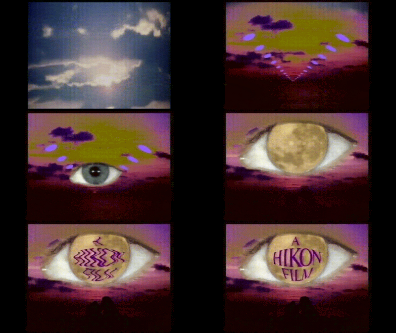
To find the really creepy logos, you've got to go off-road. These aren't film companies that anyone has ever heard of (Hikon??). And perhaps it's just as well. Though their logos are cheesy and look sort of low-budget, they have a very high freak-out factor.


I couldn't believe this WAS Orson Welles, thought it was maybe a Welles impersonator, but yes, that's him. I don't know anything about a Rainbow Release. His career did sort of slide downhill at the end. Note how the zoom-in stops at a certain point. That's kind of like MY zoom-ins, where the camera suddenly goes "bzzzzzzzzt".


This whole thing is so weird! Who's that guy, that face that appears in the militant-looking ABC logo, the one with the eagle catching a lightning-bolt in its beak? This looks like the emblem for a white supremacist group. The Super Circus thing is just bizarre. It has a fall of Rome flavour to it. Pre-Howdy Doody, I think.


Again. "An Apple Film". Not sure about this one at all. Reminds me, for some reason, of Dodo, the Kid from Outer Space - maybe the very basic animation. 


Red blobs in space? Yes, it's exactly the same.


There's a whole sub-genre of logos from Indian movies. These are quite spectacular, but in most of them nothing moves very much. It's a sort of tableau, with alarming or even freaky-sounding music and sound effects. This one actually has a form of animation in it, though it's strange. A white blob turns into a woman. By the way, if you ever watch any of those "scary logo" compilations with the sound off (late at night, when you really should be in bed), they are suddenly a whole lot less scary. Sound is about 60%.


This one  shows up in EVERY scary logo compilation, and do you know what? IT ISN'T A LOGO. At all. It's just a shot at the start of a very old Wizard of Oz  movie from 1914. I don't know how they can call it a logo, but it is very strange. So I'll include it. And I've run out of them anyway.


LUNO.

Saturday, April 9, 2016

Why was I always so terrified as a kid?


This is why. THIS would come on TV, probably when I was about 3 or 4 years old. Though I now think it's quite beautiful and use it as one of my signature gifs at the end of posts (and that's what those are, folks, in case you're thinking they're totally irrelevant), it petrified me then, because I had no idea what a logo was - or a network - or, frankly, even a peacock. I was a toddler, for God's sake, I was barely out of diapers, and permanently confused.


It's a strange sort of thing because it totally runs counter to the ugly, primitive-looking logos you saw for the other networks (and I have a gif for that!). It has a severe, harlequin-looking aspect to it and is quite complex, and when it goes from stark black-and-white to colour, you just don't expect it. It jumps off the screen, as they say. Someone designed this back in 1957, someone with real talent, and NBC then proceeded to dumb it down for the next 60 years. It's still used, only the peacock has something like four colours. Oversimplification. 


Like 95% of households in the '50s, we had a black-and-white TV, so what was the point of a colour logo anyway? And yet, and yet. The slightly disturbing quality of this early logo is what makes it so effective and such a piece of art. But it still creeps me out big-time. 

And the music, my God, the MUSIC on this thing - it still makes my guts cringe. It just scared me then. It wasn't friendly. At all. It didn't make you want to watch the show. It made you want to run screaming out of the room. It has a big gong and evil upward glissandi on dark woodwinds and a sort of dissonant non-melody that doesn't belong on TV at all.  I had not heard the music since probably 1957 or 1958, I had forgotten it even existed and had pushed the whole nightmare into the back of my head, when I stumbled on it on YouTube, and my God! I cannot even tell you how strange I felt. I was rocketed back in time, and let me tell you, it was not a pleasant feeling to suddenly find myself getting smaller and smaller and more and more frightened. 


Most of the "scary" logos on YouTube (and there are many compilations, all of which I watch obsessively late at night) really aren't that scary. If you turn the sound off, they aren't scary at all. The music is the main element of terror here - it's all hair-raisingly aggressive, with loud percussion like somebody hammering on railroad spikes, whining synthesizers, etc. In many cases it's more like noise. Why did they do this? You can look away - easily - but you can't keep sound out, even if you stick your fingers in your ears. This is why ads in general are so repetitive and shrill. Also why I find gif-making so comforting, because there is no sound involved at all.


BTW, this is the peacock logo only a few years later. It has been made a damn sight friendlier, with blurring Venn diagrams of colour rather than that odd black-and-white abstract net, and completely different music, with bubbly arpeggios on a clarinet and cheerful trills on a flute. All the threat has been removed. Gone is that King of Siam severe, exotic quality. But the final splash of pigment, the startling, paint-brushy effect at the end is still there. 


But look you here! as the ghost said to Scrooge. OK, it's fatter, has a shorter neck, but doesn't this partridge just a LITTLE bit resemble the NBC peacock without its tail feathers? It's facing the same way, it has a similar doohickey on top of its head, and - well. It could be I'm reaching here. But what network WAS that show on anyway? (frantic interval while she goes on Wikipedia - watch this in the interim!):


(gasp, gasp) I'm back. No, no, I was wrong, The Partridge Family ran on ABC, not NBC, and yet, here it is, this weird resemblance between the peacock and the partridge. Maybe it was one of those unconscious things (I don't mean as in knocked out), i. e. the artist or animator borrowing the image, or even sending it up: a fat, tailless NBC peacock equals a partridge! Any show that gave the world both David Cassidy and Danny Bonaduce has a lot to answer for. So I'd say stealing a logo is the least of its crimes.


Badda-boom: Here is the logo NBC uses now. Compare and contast. At least the music doesn't scare me.